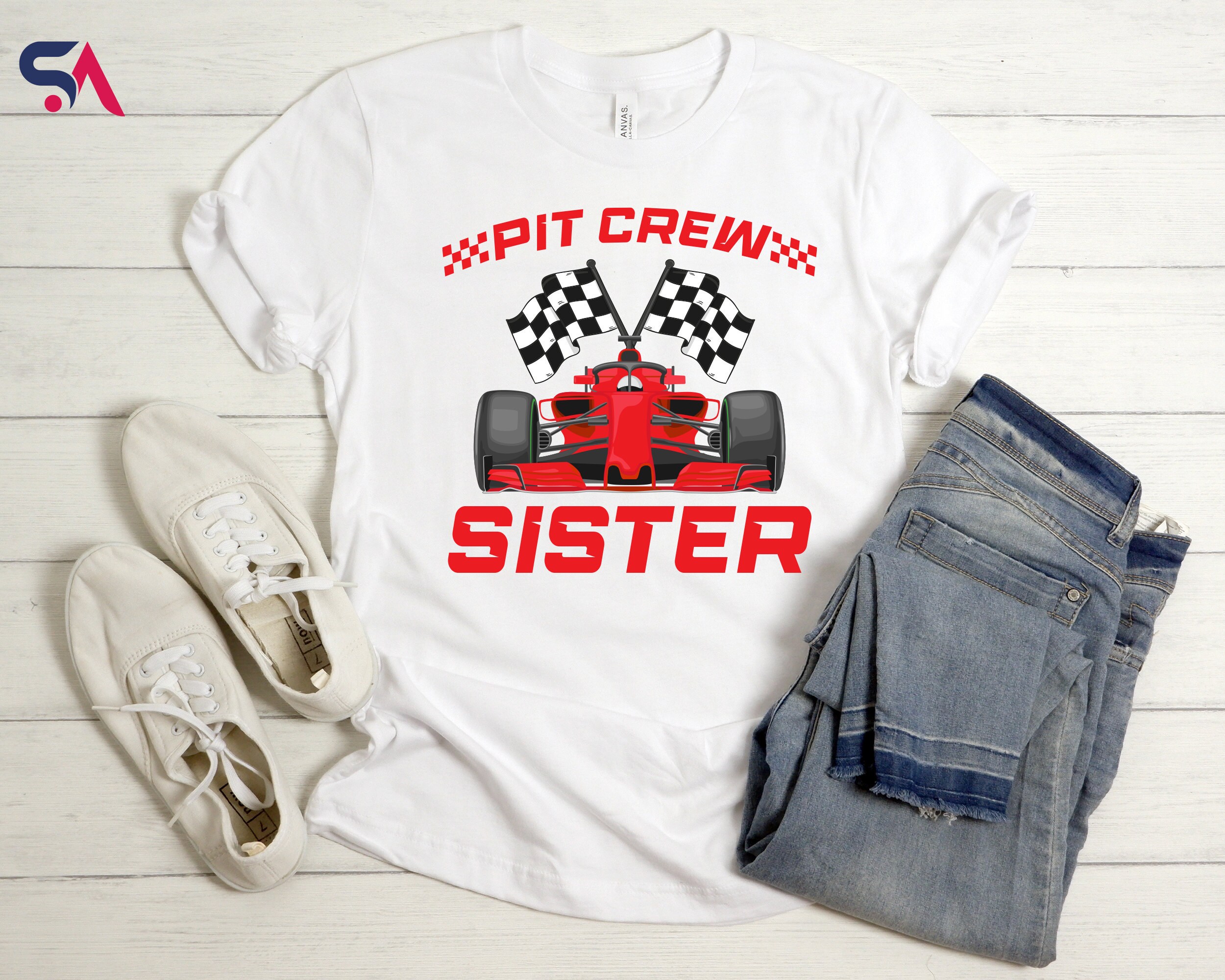
T-shirt design is an art that blends creativity, message delivery, and aesthetics. One of the most crucial yet often overlooked aspects of this process is font selection. The right font can make a design stand out, communicate the intended message effectively, and enhance the overall appeal of the T-shirt. In this blog post, we will explore why font selection is so important and how to choose the perfect typeface for your T-shirt designs.
1. Communicating the Right Message
Fonts have personalities, and each typeface conveys a different mood and emotion. A playful, handwritten font might work well for a casual or humorous design, while a sleek, modern sans-serif font is better suited for a minimalist or corporate T-shirt. Choosing the wrong font can dilute your message or send unintended signals, making font selection a crucial decision in the design process.
2. Enhancing Readability
T-shirts often serve as a form of expression, whether they display slogans, quotes, or branding. If the chosen font is difficult to read, the message may be lost. Factors such as letter spacing, font weight, and contrast against the fabric color all play roles in ensuring legibility. Script fonts, for example, may look stylish but can be hard to read from a distance, while bold sans-serif fonts typically offer better clarity.
3. Strengthening Brand Identity
For businesses, font selection is a key component of branding. A consistent font style across merchandise helps build brand recognition and reinforces identity. Whether designing for a clothing brand, a promotional event, or a social cause, the right typography aligns with the overall aesthetic and branding strategy.
4. Creating Visual Impact
A well-chosen font enhances the visual appeal of a T-shirt and makes it more attractive to potential buyers. Fonts with unique characteristics, such as distressed textures, futuristic elements, or vintage flair, can elevate a simple design into a striking piece of wearable art. Combining typography with graphics further amplifies the impact of the design.
5. Considering Trends and Timelessness
While design trends evolve, some fonts remain timeless. Choosing a trendy font may make a design feel current, but it also risks becoming outdated quickly. On the other hand, classic typefaces ensure longevity and broad appeal. A balance between trendiness and timelessness can help create a design that remains relevant for years.
6. Adapting to Printing Techniques
Different printing methods impact how fonts appear on fabric. Screen printing, direct-to-garment (DTG), and heat transfer each have unique characteristics that affect font clarity. Fine details in delicate script fonts may not translate well in certain print techniques, whereas bold fonts generally perform better across all methods. Understanding the limitations and possibilities of printing helps designers make informed font choices.
Conclusion
Font selection in T-shirt design is more than just picking an aesthetically pleasing typeface—it’s about conveying the right message, ensuring readability, reinforcing branding, and maximizing visual appeal. By carefully choosing fonts that align with the intended theme and audience, designers can create T-shirts that not only look great but also effectively communicate their message. Whether designing for personal expression, business branding, or creative projects, typography plays a vital role in making a statement through wearable art.
